Pages

19.11.12

Bad Meet Evil

Its been a while since ive had the chance to catch up with a hip hop group and interview them, but now that uni is over for the year i'm more dedicated then ever to jump back on my blog shit and keep it up to date. So to kick off the next series of interviews i've decided to turn to another element of hip hop, street art and street ware. I was fortunate to steal some of Joseph Fonti, founder of Bad Meet Evil to ask him about past works, what the future holds and how the clothing label came about. Check it out below, and if you like what you see head over to www.badmeetevil.com and pick up some fresh threads or head to Facebook to stay up to date with whats new.


Firstly you started Bad Meet Evil in 2010, what was it that made you take your drawings, which at this stage was nothing more than a hobby to something that you wanted to display and distribute on the public scale?

I think it was a combination of two things. Firstly, I’d always loved streetwear- the graphics, the attitude, everything about it appealed to my personality heavily. So naturally, to own my own label was my ultimate ‘dream job’. The other significant ‘kick starter’ was the fact that I could never see myself working for a boss. I don’t like being told what to do or how to do it, so I thought that combining my artwork with a label could be a ‘way out’ of the system.


The name Bad Meet Evil, is one that will come to be a household name in the future. Where did it originate from and what is the philosophy behind it and the label as a whole?

Haha. Cheers for the confidence booster dude. The name was actually inspired by the track, ‘Bad meets evil’, by Eminem and Royce. Back when I chose the name, the duo was really underground, and I thought that track captured my artwork and the essence of what I was doing at the time perfectly. I didn’t know that a year later they’d bring out a commercial album together- that really fucked with my head for a while. In fact, I’m very close to just changing the name of the label to ‘BME’. It’s been known as that for a long time now, and I think it’s time to break free of any associations people might think the label has with Em and Royce. 


Anyone who has followed Bad Meet Evil over the past few years will know of the battle you have put up to the major labels in the industry and various street ware stores around the country. What is it that drives you to push on through when so many stores and labels have rejected you as a designer and as a label?

I wouldn’t say that they’ve ‘rejected me as a designer or a label’. Id say that what I do, and how I do it, is something completely new to what most stores and labels are used to. People are always hesitant to break away from what they know, and street wear/ fashion is no different. I like to show people ‘behind the scenes’, because it’s something that I really struggled to find out about when I was first entering the market. The fact that ‘JRF’ is very closely associated with the label also means that white BME is a ‘brand’, it also has a living, breathing, contactable entity behind it. The majority of other labels like to keep this side of things hush hush. But I believe giving people an insight into the inner workings of what I do allows them to appreciate it on a whole new level. 


In the early days of Bad Meet Evil you did some design work for 360, this would have been an amazing platform to launch BME into the public eye. How did the relationship between BME and 360 form?


I actually went to a gig of his at the Evelyn in Fitzroy one night. It was a really small show, maybe 50 – 100 people? I was hanging out printing tees at the time with a friend of mine, and I decided to print his name on one of the earliest BME designs for shits and giggles. I gave it to him at the concert while he was on stage, and the next day he hit me up on Facebook asking me to do the illustration for his merchandise. And that’s how it all began.


Until the end of 2011 all of the designs had been your work but in early December of 2011 you collaborated with Melbourne based artist, Malicious. What prompted you to collaborate on this work? Was it a challenge to let go of the creative process or did you still have some control over the work?

I was definitely a little hesitant to let someone else have creative control. But I had a gut feeling that Malicious understood the message I was trying to convey, and would do an amazing job. Evidently he did, and ever since I’ve really enjoyed getting other artists on board from time to time. I’m very picky with my collaborations- the artist has to bring something new to the label that hasn’t been seen or done before. Everyone Ive worked with so far has nailed their graphic.


The introduction of color into each of your designs is done in a subtle manner to compliment the black and white design. With this work we can see that color is more present and that the image is on a greyscale base compared to many of your other works which are based on black and white. Was there a reason for changing this formula that had clearly been successful in the past, or is this the style of work that Nick normally produces?

Rik is an amazing artist. He usually works with colour so I told him to go right ahead and do what he usually does. Because I normally work with only black and white, I was really looking forward to doing a piece with colour in it. I love black and white because of the ‘haunting element’ it evokes. It also strips the artwork back to it’s rawest form, and in my opinion, can sometimes convey the most powerful imagery. It also looks dope on white tees.


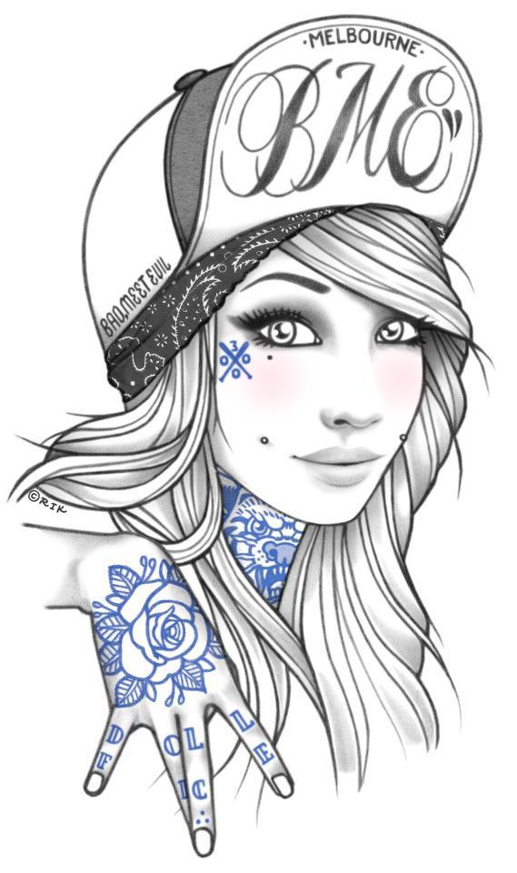
What is the process that normally occurs when another artist designs a piece for BME? Who approaches who or are you generally mates with them before commencing work with them?

It varies from artsist to artist. I saw some of Malicious’ work at a gallery and hit him up from there. As for Rik and Ben, I’d always been fans of their work, and just reached out, hoping they’d dig the idea. Sarah and I have been pals for a while, so that one was a little more chill. 


Recently you posted a status on Facebook explaining the pressure that you put on yourself and the expectations you have of yourself. When designing a work how much of an impact dose the public have each design, do they influence the content, style etc.


I definitely consider whether or not my fans will dig what I’m planning on drawing before I start a new piece. At the same time, you can’t please all the people all the time, so I have to find a happy balance between what I think looks dope, and what others will like too. At the end of the day, my artwork is still an expression of who I am, and people are either going to connect with it, or they won’t.


The Mr Squiggles work is one of my favorite designs as it brings back memories form when I was a kid watching it. Its designs like this and the Evil Mickey Mouse, and Ninja Turtles that I so many of your fans love. I feel as though putting these cartoon characters we grew up with as innocent children in a not so innocent situation reflects so the changes we go through from children to adults. What is it that makes you drives you to take these childhood characters and reproduce them?


Yeah I’ve always loved messing with childhood characters. I’m not sure why I do it to be honest. Maybe it’s a subconscious thing. I love the line work for many of these characters- they’re simple but bold. Ultimately I think I’m a massive kid at heart who dosen’t want to grow up. I collect toys and still watch cartoons. Sometimes I really question whether I’m mature enough to run a label.


The Nasty Naz artwork is simply amazing. Naz is one of Hip Hop’s godfathers and has done so much for what we take for granted today. There is no doubt that Sarah McCloskey has done it justice to this image. There are many other figures in the Hip Hop scene that you could have easily chosen weather they be Australian or American. What made you choose Naz over others and can we expect any more BME prints with other Hip Hop greats?

Nas has always been one of the most influential artists in my life. I specifically chose him over others for a number of reasons. I felt that Biggie and tupac, while amazing artists in their own right, had been done to death in the street wear industry. I also think that a whole heap of people just jump on board with the Biggie and Tupac thing, not because they appreciate their music, but more so because society has generally accepted them as being ‘cool figures’. I chose Nas because he isn’t as well known, and for someone to buy the tee, they’d really have to appreciate what he’s done for hip hop, on a ‘real’ level. I basically wanted to eliminate any posers wearing my shit.


It seems as though that every time i check back to the BME Facebook page that you have always got something new on the go weather they be a new set of limited edition pocket tees, space caps or an amazing design for you next tee. So I have to ask whats in the pipelines for the next bit for BME? 

Cogs are turning. Minds are churning. This new shit that I’m working on is going to put anything else I’ve ever done to shame. I’ve got a whole heap of new projects going on at the moment, some of which I’m really hoping will change the industry. I’m just hoping to get everything out on the market before this candle that I’m burning explodes. Fuck it, hey.